Why do we still print the course syllabus?
Sean Kheraj, LA&PS
Every August, my department puts out a call for print orders for course syllabi. All course instructors are asked to submit digital files to be printed for thousands of undergraduate and graduate students. On the first day of classes, professors and teaching assistants march through the halls with large stacks of paper to be distributed to new students.
A couple years ago I started re-thinking the syllabus to address some issues that I noticed:
- Static print copies of the syllabus seemed to make less sense as course websites had become the central point of information about my courses. I was duplicating my work by designing and creating elaborate course websites and then doing the work all over again for a print copy of my syllabus. Course websites like this one seemed much better.
- Much of the policy information on my syllabus involved links to relevant university websites where the policies are more accurately written than what I could reproduce on my own. There is a higher likelihood that I will make an error trying to paraphrase a university policy than if students simply go directly to the source for that info. For instance, students shouldn't rely upon my own interpretation of the Student Code of Conduct, they should read the actual Student Code of Conduct. As such, hyperlinks made less sense on a print copy of the syllabus and it made more sense to include this on a course website.
- The majority of the readings for my courses are online. Having a print copy of the syllabus with the detailed breakdown of the readings made little sense either as students would still need to logon to the course website to access the readings. Additionally, my weekly modules included other web-based activities and resources with hyperlinks.
- My contact information seemed more useful on a website than a print syllabus. Students can just click on my email or Twitter account or whatever else to get in touch with me directly. I also offer video office hours with a link on my course website that drops students into a live video chat with me.
- A couple years ago, I started posting video instructions for assignments. I would embed these on the assignment description pages on my course websites. I couldn't do this on my print syllabus.
- Students can't lose a course website.
Overall, my course websites seemed to be fulfilling all the roles of a syllabus and doing a better job. This is what drew me to the idea of the visual syllabus. It was an opportunity to completely rethink the physical object that I would hand out to students. If my course websites were the optimal way of communicating every relevant detail about my courses, what should I hand out to students as a syllabus, if anything at all? I still thought that students should be able to walk away from the first class with some kind of guide or map to the course. I wanted them to have something they could quickly refer to in order to get a synoptic view of the course, a bird's-eye perspective.
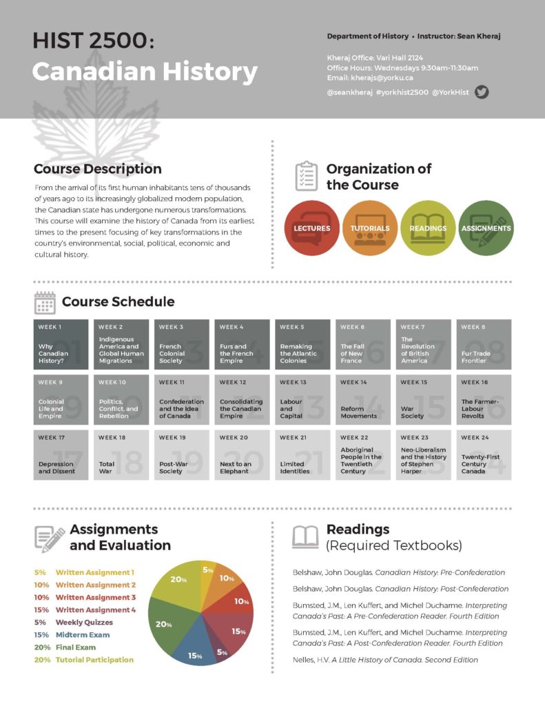
Last November, I attended an e-learning conference and participated in a workshop led by eCampus Ontario. I was paired with a graphic designer named, Ken Hui and we collaborated on what's called a visual syllabus based on my undergraduate Canadian history survey course. A visual syllabus is basically an infographic of your course. This is not a new idea. There are plenty of examples out on the web. Ken and I discussed the idea of the syllabus and its main objectives. He then helped me to synthesize the most important components of my course. The visual syllabus would then utilize graphic and visual representation to convey at a glance, the most pertinent information about my course.
Here's Ken's original design:
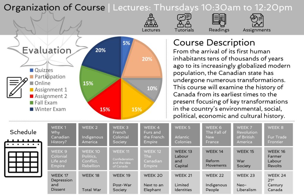
This summer, I took Ken's original design and made my own version. This time, I decided to set the dimensions to roughly the size of a postcard. I've now ordered a set of postcards to distribute to my class in September. On a compact card, students now have access to a broad overview of the most relevant information about my course:
Readers can download a .pptx file that I used to create this visual syllabus here. With this file, you can create your own.
Obviously, this visual syllabus is not a substitute for the old print version that I used to produce. My course websites now include all of the policy details, weekly reading assignments, written assignments, and additional resources that used to appear on my lengthy print syllabus. The visual syllabus is something new. I hope it better communicates the structure of my course and offers students a more transparent view of the course as a whole. At the very least, it will be a fine souvenir.


